Light Mode
User Menu
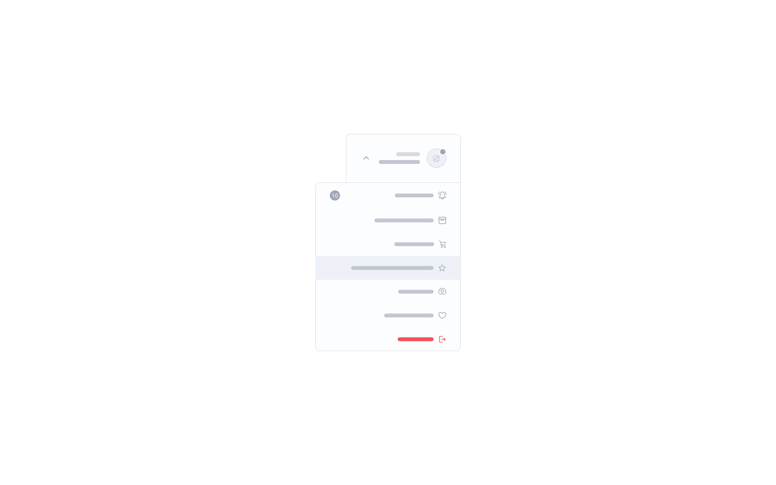
The <salla-user-menu> web component is used to show a navigation menu list with links that route users to accomplish user-related functions including Login, Logout, Profile, Sign Up, and more.
Example

Usage
<!-- Basic User Menu component usage -->
<salla-user-menu
 inline="true"
 show-header="true">
</salla-user-menu>
This JS web component can be targeted for styling by its .s-user-menu class. Following is a complete source code for customizing this component:
.s-user-menu{
  &-wrapper{

  }
  &-toggler{

  }
  // Default trigger
  &-trigger{
    &-avatar{

    }
    &-content{

    }
    &-hello{

    }
    &-name{

    }
    &-icon{

    }
  }
  // Your custom trigger
  &-trigger-slot{

  }
  &-dropdown{
    &-header{
      img{

      }
      &-content{

      }
      &-close{

      }
    }
    &-list{

    }
    &-item{
      &-title{

      }
      &-badge{

      }
    }

  }
  &-inline{

  }
}
Properties
| Property | Attribute | Description | Type | Default |
|---|---|---|---|---|
| Avatar Only | avatar-only |
Whether or not to display the trigger as only an avatar | boolean |
false |
| Inline | inline |
Whether or not to show only the list without the dropdown functionality | boolean |
false |
| Relative Dropdown | relative-dropdown |
Whether or not to make the dropdown menu relative to parent element | boolean |
false |
| Show Header | show-header |
Whether or not to present the dropdown header in mobile sheet | boolean |
false |
Slots
The slots makes it customizable to modify certain labels, such as trigger.
| Slot | Description |
|---|---|
trigger |
Replaces the trigger widget label with replaceable props which are {avatar}, {hello}, {first_name}, {last_name}, {icon}. |
Last modified: 3 months ago
