 Salla Docs
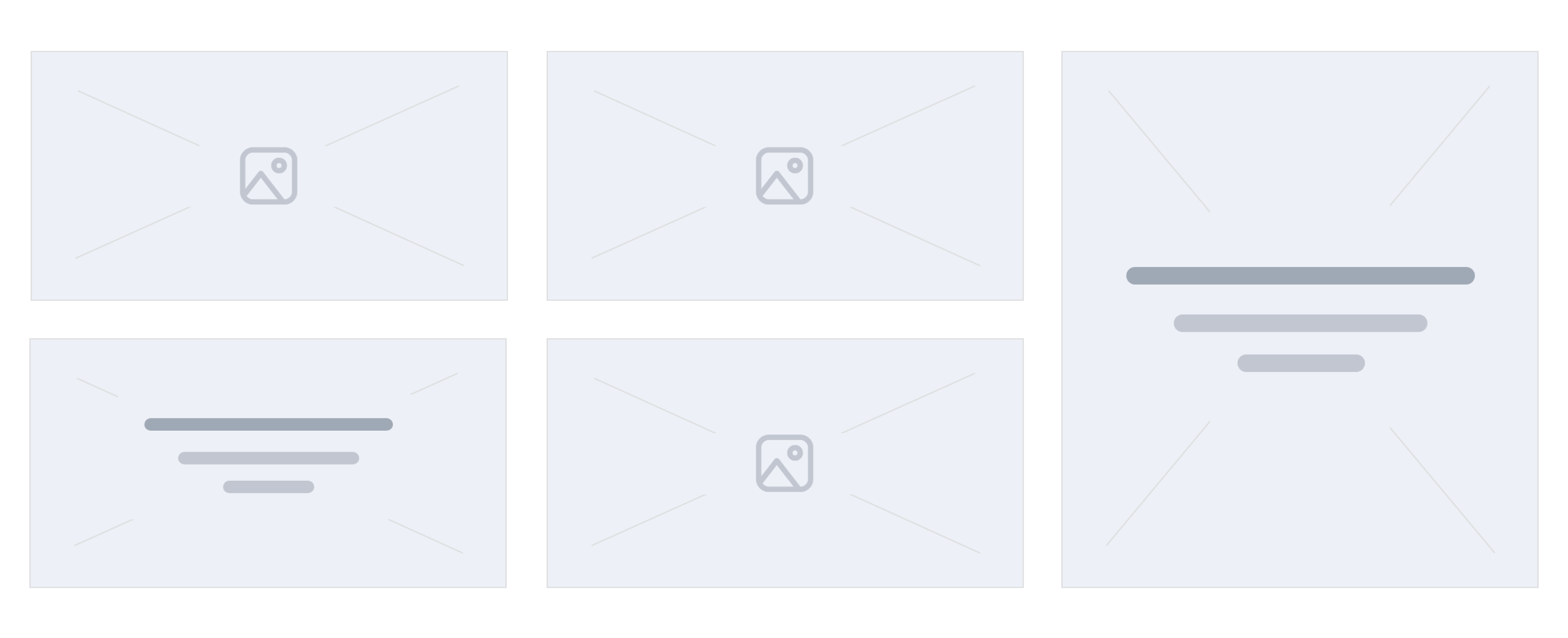
Enhanced Square Banners
The enhanced square banner component is similar to the Square Photos component, however it gives an extra option to add texts for the inner element of the smaller images.
Following is the location of this component.
└── src
  ├── views
   ├── components
   |  ├── home
   |  |   ...
   |  |  ├── enhanced-square-banners.twig
          ...
Example
Settings
This component is a custom component. Its configuration is described in the twilight.json as follows:
{
  "version": ...,
  "theme_name": ...,
  "repo_url": ...,
  "support_url": ...,
  ...
  "components": [
    {
      "name": "enhanced-square-banners",
      "title": "Square images (enhanced)",
      "icon": "sicon-image",
      "path": "home.enhanced-square-images",
      "fields": [
        {
          "id": "banners",
          "type": "collection",
          "format": "collection",
          "required": true,
          "minLength": 1,
          "maxLength": 5,
          "label": "Images List",
          "fields": [
            {
              "id": "image",
              "type": "string",
              "format": "image",
              "required": true
            },
            {
              "id": "url",
              "type": "string",
              "format": "url",
              "label": "Link",
              "placeholder": "Enter the link here...",
              "inputType": "url",
              "required": true
            },
            {
              "id": "title",
              "type": "string",
              "label": "Main Header (optional)"
            },
            {
              "id": "description",
              "type": "string",
              "format": "textarea",
              "label": "Description text (optional)"
            }
          ]
        }
      ]
    }
  ]
}
Theme Preview
The components can be managed using the theme preview in the Theme menu item of Salla Partners Portal. The developer can edit the component and enable it in the theme preview dashboard.
Variables
The variables of this component are fetched from the twilight.json file as per the merchant settings. They are located in the components section's fields.
Usage
In this component, we use a loop statement to go through banners and display both banner.image and banner.url.
{% for banner in component.banners %}
<div style="background-image: url('{{banner.image}}');">
    <a href="{{banner.url}}">
        <h3>{{banner.title}}</h3>
        <p>{{banner.description}}</p>
    </a>
</div>
{% endfor %}