Brands
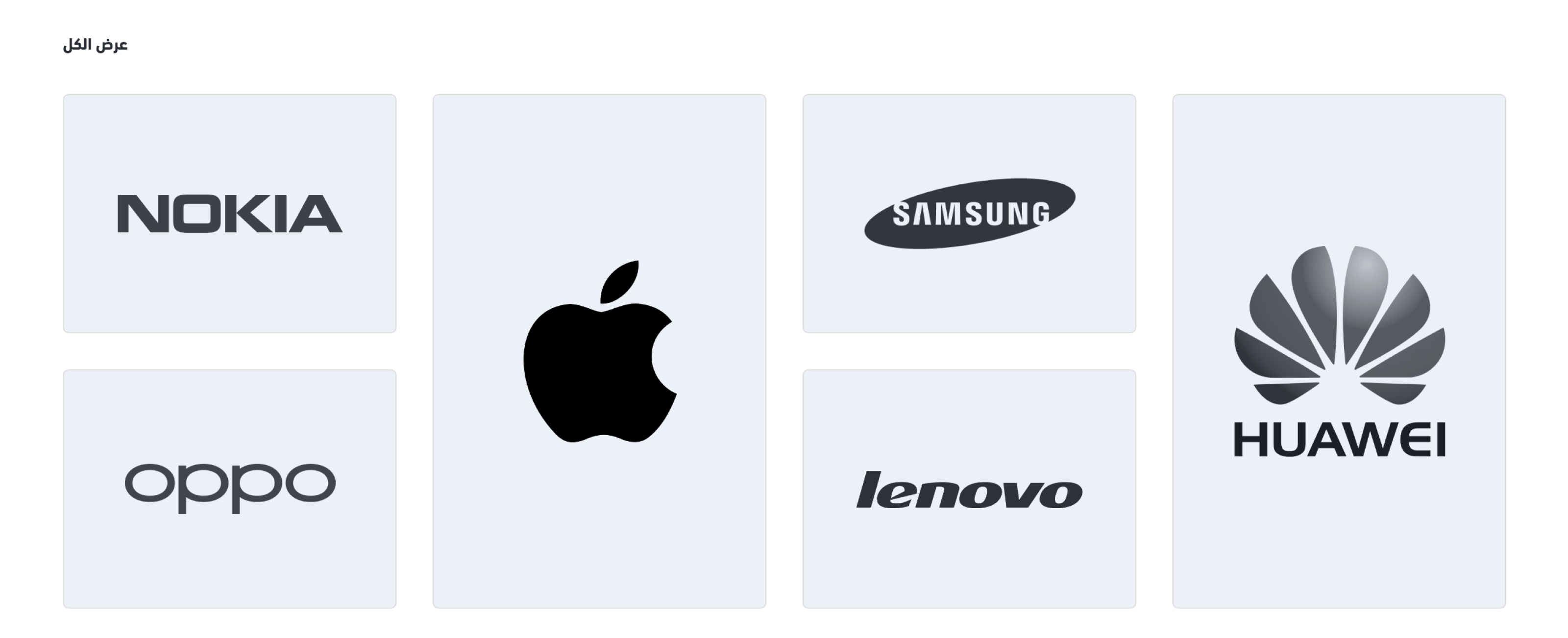
The store brands' logos are displayed using this component. Developers may use any design to style it because this is a significant section to draw the customers' attention.
Following is the location of this component.
└── src
  ├── views
   ├── components
   |  ├── home
   |  |   ...
   |  |  ├── brands.twig
          ...
Example

Settings
This component is a custom component. Its configuration is described in the twilight.json as follows:
{
  "version": ...,
  "theme_name": ...,
  "repo_url": ...,
  "support_url": ...,
  ...
  "components": [
    {
      "name": "brands",
      "title": "Brands",
      "icon": "sicon-award-ribbon",
      "path": "home.brands",
      "fields": [
        {
          "id": "brands",
          "type": "items",
          "label": "Brand",
          "format": "dropdown-list",
          "multichoice": true,
          "required": true,
          "source": "Brands"
        }
      ]
    }
  ]

}
Theme Preview
The components can be managed using the theme preview in the Theme menu item of Salla Partners Portal. The developer can edit the component and enable it in the theme preview dashboard.
Variables
The variables of this component are fetched from the twilight.json file as per the merchant settings. They are located in the components section's fields.
Usage
This component lists the brands related to the merchant's store using a loop. Based on that, a brand url and logo will be displayed as per the developer style.
<h2>{{ trans('blocks.home.browse_brands') }}</h2>
<a href="{{ link('brands') }}"> {{ trans('blocks.home.display_all') }} </a>
{% for brand in component.brands %}
    <a href="{{ brand.url }}">
        <img src="{{ brand.logo }}" alt=""/>
    </a>
{% endfor %}
