Light Mode
Search
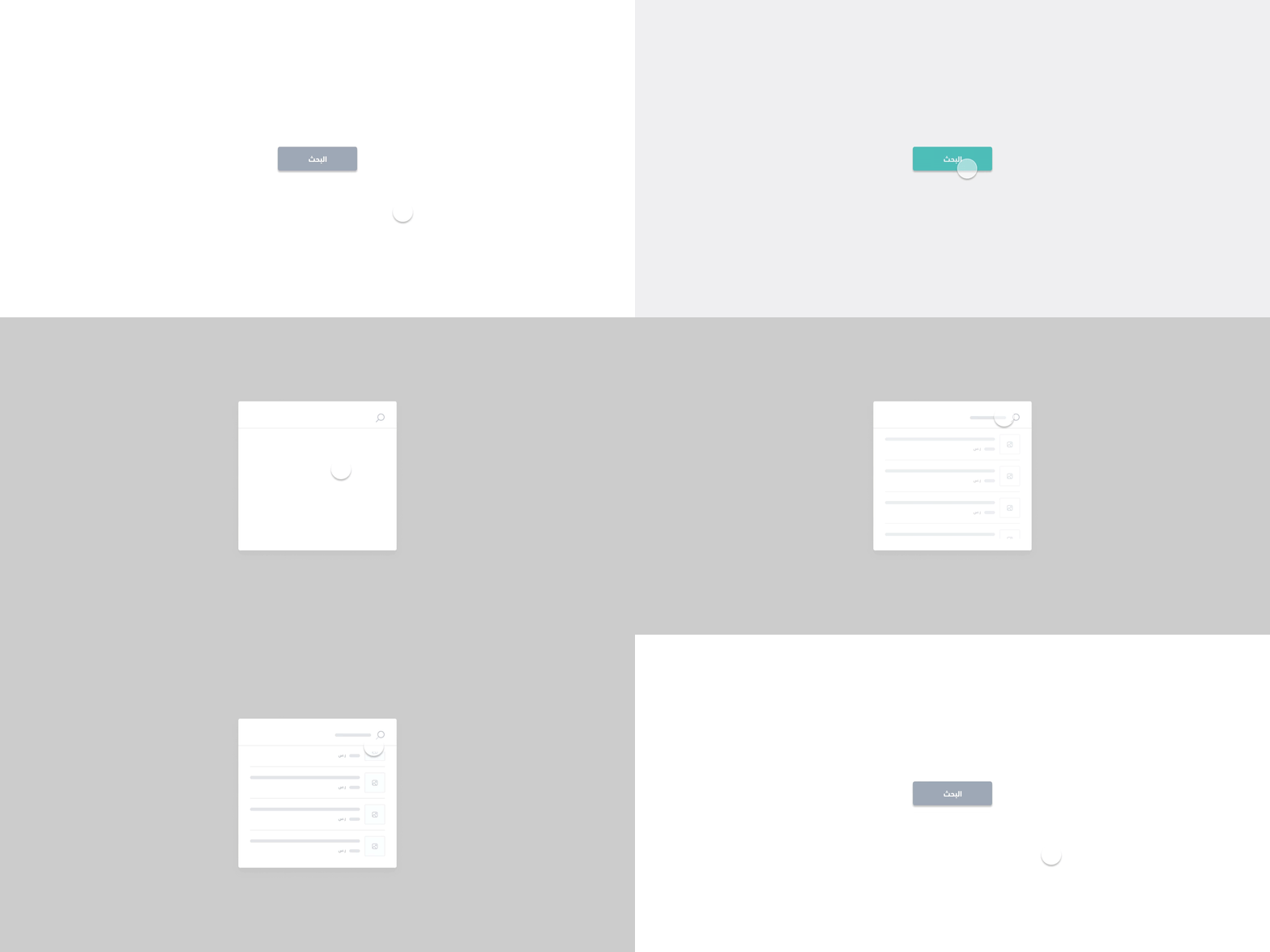
The <salla-search> website element shows a search box, field, or bar. Its specific purpose is to accept user input for database searching. It consists of a Modal activated by the Button component, and that can be customized using the slots' parameters available.
:::tip[Note]
Available API Endpoints for the Search component is:
Example

Usage
<!-- Button to open search component-->
<salla-button onclick="search.open()">Search</salla-button>

<!-- Basic Salla Search component-->
<salla-search></salla-search>

<!-- Inline Search Bar Input Field-->
<salla-search inline="true" height="50"></salla-search>

<!-- Custom Slots within Inline Search Bar-->
<salla-search inline>
    <div slot="product">{name} | {price} | {regular_price} | {image}</div>
</salla-search>
// Save reference to the Search Component below
var search = document.querySelector("salla-search");
This JS web component can be targeted for styling by its .s-search class. Following is a complete source code for customizing this component:
.s-search {
  &-inline{

  }
  &-container {
    &-open {

    }
  }
  &-input {

  }
  &-icon {

  }
  &-spinner {

  }
  &-spinner-loader {

  }
  &-results {

  }
  &-no-results{

  }
  &-container-open{

  }
  &-product {
    &-image-container {

    }
    &-image {

    }
    &-details {

    }
    &-title {

    }
    &-price {

    }
  }
}
Properties
| Property | Attribute | Description | Type | Default |
|---|---|---|---|---|
| Height | height |
Adjusts the height of the search input Bar | number |
'60' |
| Inline | inline |
Sets the component display without the pop-up modal window | boolean |
'false' |
| Oval | oval |
Creates the Search Bar in an oval shape by adding a border radius to the input | boolean |
'false' |
Slots
Theslots makes it customizable to modify certain labels, such as product where developers can self-modify labels of name, price, regular_price, and image.
| Slot | Description |
|---|---|
product |
In the results, the products card outcome is replaced by the following replaceable props: {name}, {price}, {regular_price}, {image}. |
Last modified: 3 months ago
