Light Mode
Contacts
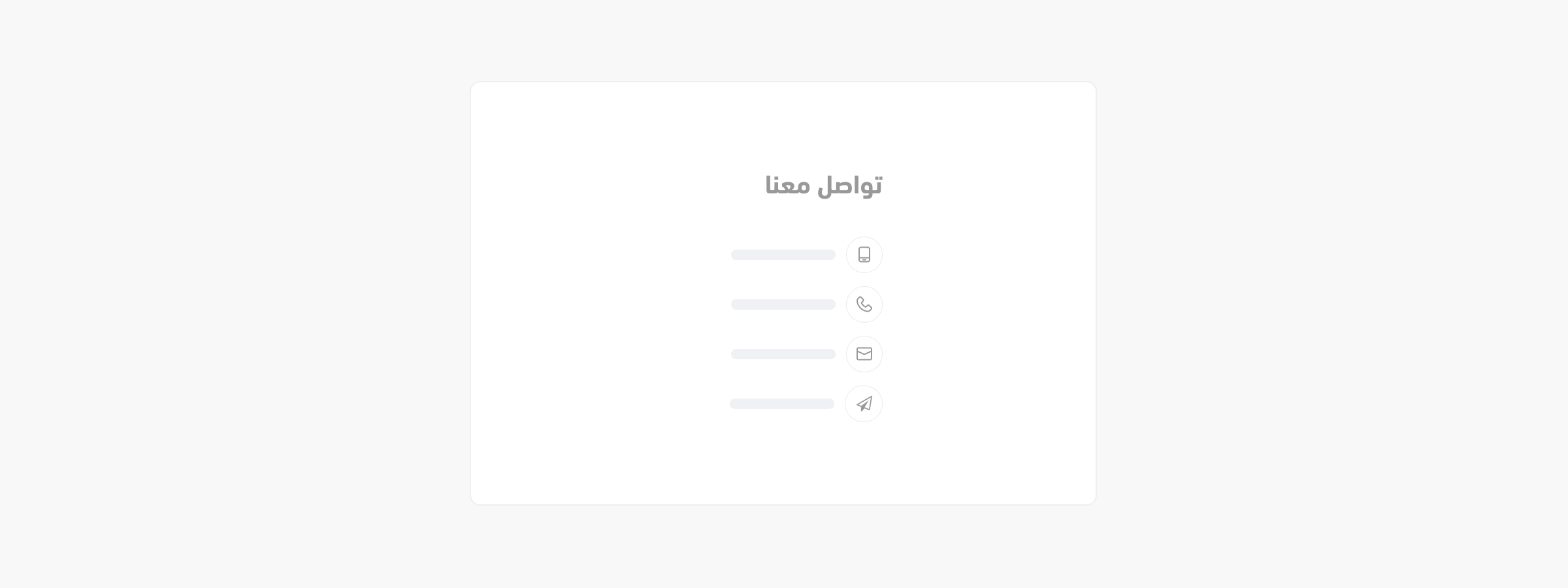
The <salla-contacts> web component allows users to display contact items. It is possible to include the salla-social component for icon visual representation.
Example

Usage
# Basic usage
<salla-contacts is-header=“false” hide-title=“true”></salla-contacts>

# salla-social component included
 <div>
   <salla-contacts></salla-contacts>
   <div class="lg:hidden contact-social">
      <salla-social></salla-social>
   </div>
</div>
This JS web component can be targeted for styling by its :host class. Following is a complete source code for
customizing this component:
    :host {
    display: block;
    }
Properties
| Property | Attribute | Description | Type | Default |
|---|---|---|---|---|
| Contacts Title | contacts-title |
Title for the social block within the footer section | string |
undefined |
| Hide Title | hide-title |
Whether or not to toggle the visibility of the title | boolean |
undefined |
| Horizontal | horizontal |
Whether or not to switch between vertical and horizontal display of content | boolean |
undefined |
| Icons Only | icons-only |
Whether or not to display only icons or both icons and labels |
boolean |
undefined |
| Is Header | is-header |
Whether or not the content serves as a header | boolean |
undefined |
Slots
Theslots makes it customizable to modify certain labels, such as contact.
| Slot | Description |
|---|---|
contact |
This slot has replaceable properties, which are icon and value. |
Last modified: 3 months ago
