 Salla Docs
Light Mode
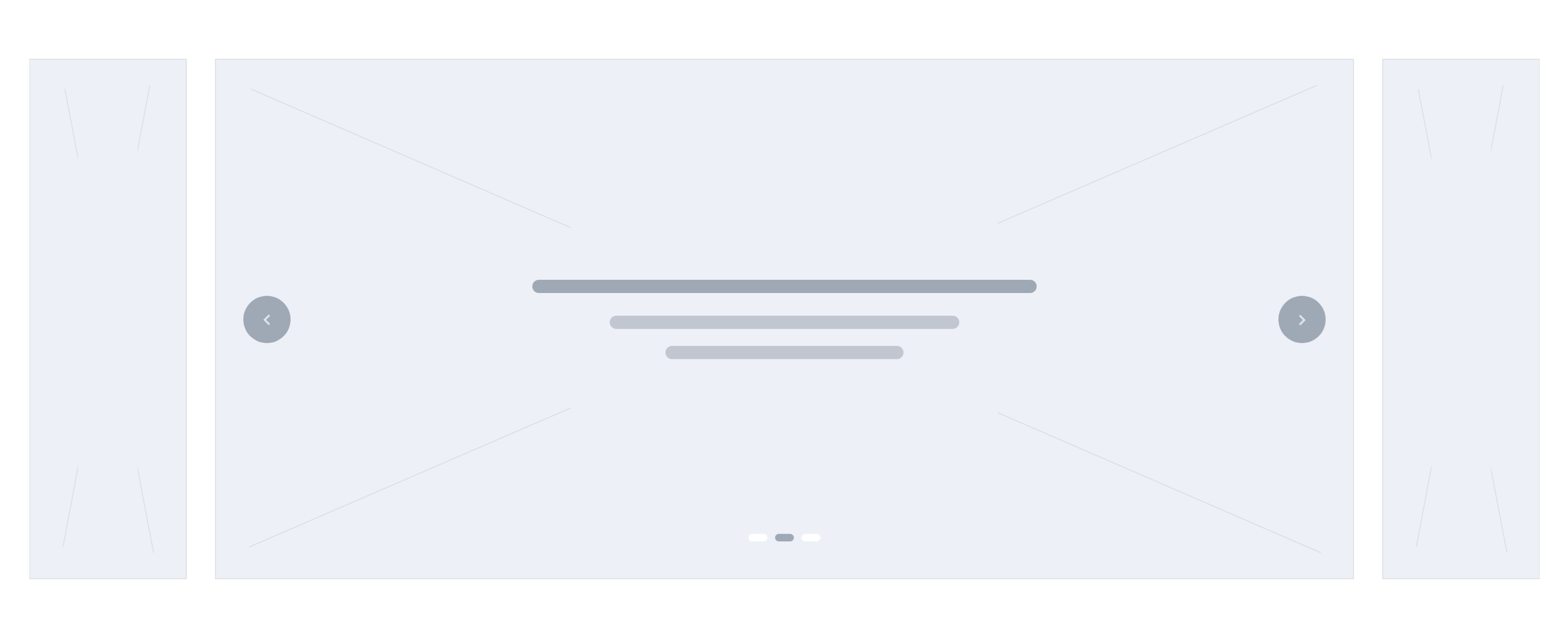
Enhanced Slider
This component is similar to the Photos slider, which displays various images. However, it gives an extra option to add texts for the inner element of the pictures.
Following is the location of this component.
└── src
  ├── views
   ├── components
   |  ├── home
   |  |   ...
   |  |  ├── enhanced-slider.twig
          ...
Example
Settings
This component is a custom component. Its configuration is described in the twilight.json as follows:
{
  "version": ...,
  "theme_name": ...,
  "repo_url": ...,
  "support_url": ...,
  ...
  "components": [
    {
      "name": "enhanced-slider",
      "title": "Slider (Emhanced)",
      "icon": "sicon-image-carousel",
      "path": "home.enhanced-slider",
      "fields": [
        {
          "id": "is_wide",
          "type": "boolean",
          "text": "Wide Screen",
          "format": "switch",
          "selected": true
        },
        {
          "id": "slides",
          "type": "collection",
          "format": "collection",
          "required": true,
          "minLength": 1,
          "maxLength": 10,
          "label": "Images List",
          "fields": [
            {
              "id": "image",
              "type": "string",
              "format": "image",
              "required": true
            },
            {
              "id": "title",
              "type": "string",
              "label": "Header Title (optional)"
            },
            {
              "id": "description",
              "type": "string",
              "format": "textarea",
              "label": "Description (optional)"
            }
          ]
        }
      ]
    }
  ]
}
Theme Preview
The components can be managed using the theme preview in the Theme menu item of Salla Partners Portal. The developer can edit the component and enable it in the theme preview dashboard.
Variables
The variables of this component are fetched from the theme.json file as per the merchant settings. They are located in the components section's fields.
Usage
This component uses a slider to display the images, where the developer can use any slider library.
{% for slide in component.slides %}
    <img src="{{ slide.image }}">
    <h3>{{ slide.title }}</h3>
    <p>{{ slide.description }}</p>
{% endfor %}
Last modified: 10 months ago