Light Mode
Offer
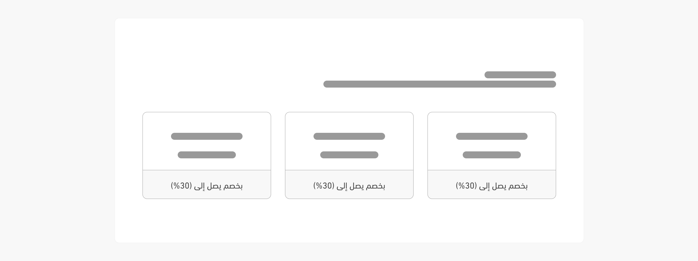
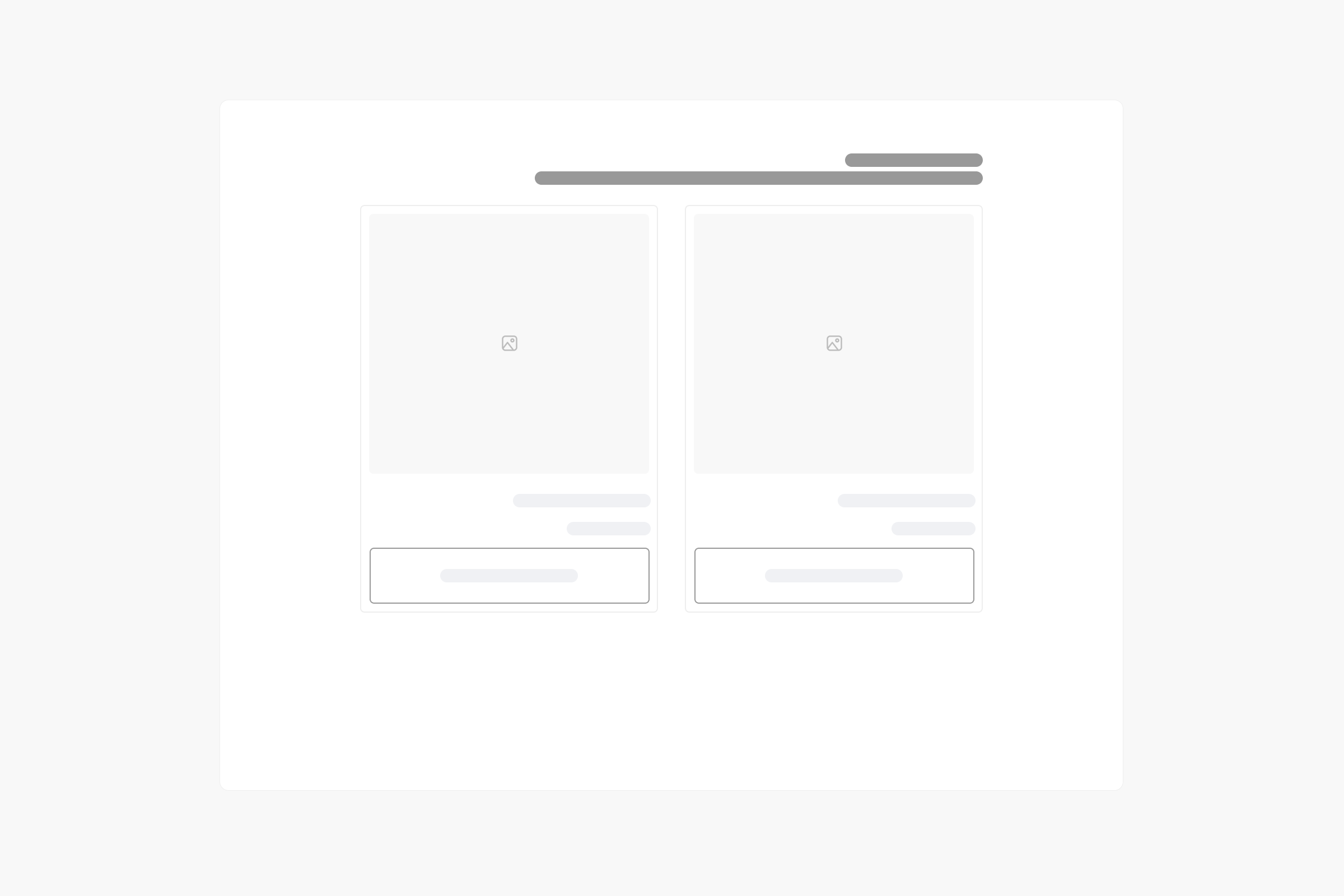
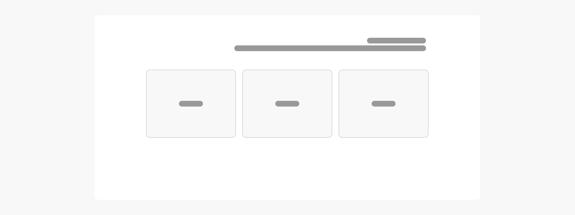
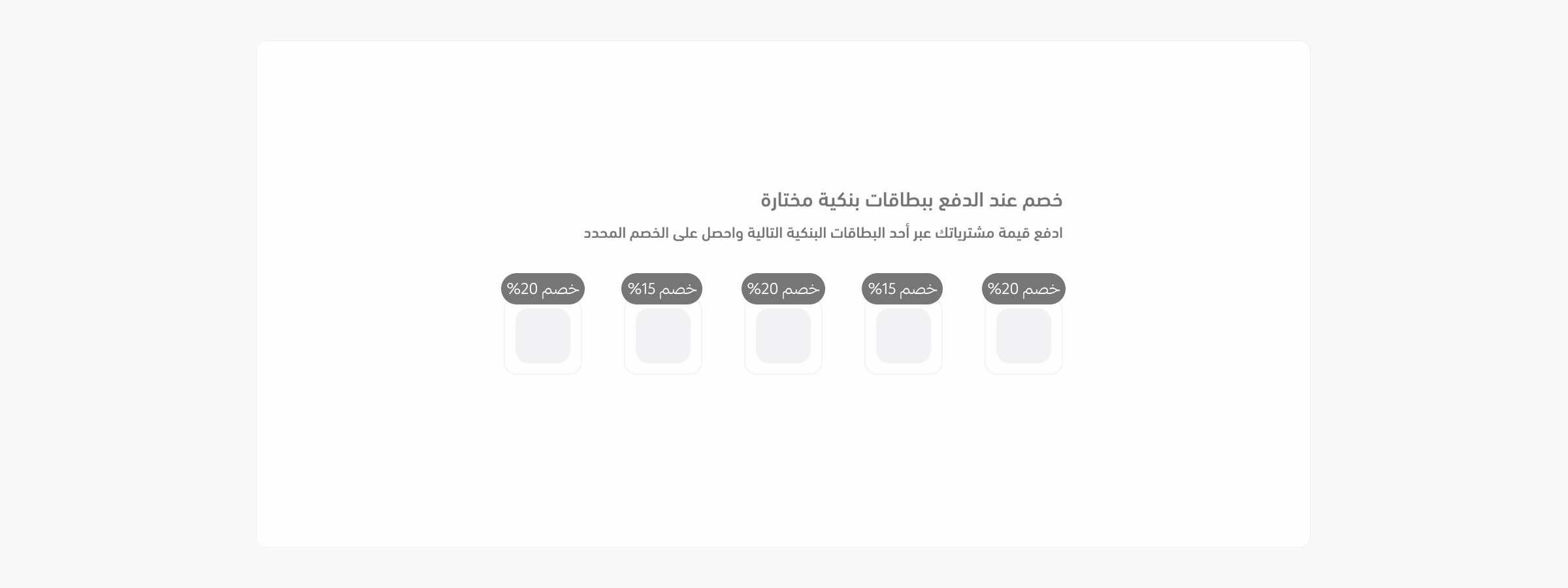
The <salla-offer> web component displays offers, categories, products, banks, and discount information. It uses the salla-slider component for carousel functionality.
Example
   Usage
<salla-offer product-id="673490471"></salla-offer>
.s-offer-wrapper .s-slider-block__title {
  h2 {
    font-size: 1.125rem;
    line-height: 1.75rem;
    color: #f87171;

    &::before {
      font-family: "sallaicons";
      content: "\ee30" !important;
      position: absolute;
      top: 1rem;
      font-size: 3rem;
      font-weight: 400;
      line-height: 1;
      color: #fef2f2;
    }
  }
}

.s-offer-bank-wrapper-sinlge-item{
    display: flex;
    align-items: center !important;
    gap: 14px;
}

.s-offer-bank-wrapper {
  display: flex !important;
  width: 100% !important;
}
Properties
| Property | Attribute | Description | Type | Default |
|---|---|---|---|---|
| Product ID | product-id |
The product ID associated with the special offer which is to be fetched. | number |
undefined |
| Product Card Component` | product-card-component |
Custom Card Component for the salla-products-list. This component allows you to customize the appearance of individual product cards within a salla-products-list. |
string |
'custom-salla-product-card' |
Slots
Theslots makes it customizable to modify certain labels, such as category.
| Slot | Description |
|---|---|
category |
This slot is for customizing the category entry layout. |
Last modified: 4 months ago
Example
Usage
Properties
Slots
