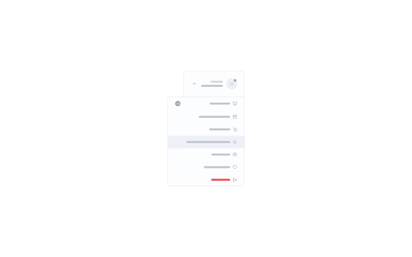
Salla Docs
Merchant API
  • Merchant API
  • Salla OAuth 2.0
Partner APIs
  • App API
  • Shipment API
Storefront
  • Twilight Engine
  • Twilight SDK
  • Web Components
  • Change Log
Salla CLI
Merchant API
  • Merchant API
  • Salla OAuth 2.0
Partner APIs
  • App API
  • Shipment API
Storefront
  • Twilight Engine
  • Twilight SDK
  • Web Components
  • Change Log
Salla CLI
Salla - Opensource
Salla - Developers Community
  1. User
  • Overview
  • Usage
  • Components Customization
  • Elements
    • Apps Icons
    • Breadcrumb
    • Color Picker
    • Conditional Fields
    • Count Down
    • Filters
    • Infinite Scroll
    • List Tile
    • Loading
    • Map
    • Modal
    • Placeholder
    • Progress Bar
    • Rating Stars
    • Reviews
    • Reviews Summary
    • Sheet
    • Skeleton
    • Slider
    • Social
    • Social Share
    • Tabs
  • Form
    • Button
    • Bottom Alert
    • Contacts
    • Date Time Picker
    • File Upload
    • Menu
    • Quantity Input
    • Select
    • Tel Input
  • Product
    • Add Product
    • Advertisement
    • Comments
    • Conditional Offer
    • Gifting
    • Installment
    • Meta Data
    • Offer
    • Offer Modal
    • Orders
    • Payments
    • Product Availability
    • Product Card
    • Products List
    • Product Options
    • Product Size Guide
    • Products Slider
    • Quick Buy
    • Quick Order
    • Scopes
    • Search
  • User
    • Cart Summary
    • Localization
    • Login
    • Loyalty
    • Rating
    • User Menu
    • User Profile
    • User Settings
    • Verify
  1. User

User Menu

The <salla-user-menu> web component is used to show a navigation menu list with links that route users to accomplish user-related functions including Login, Logout, Profile, Sign Up, and more.

Example#

User Menu

Usage#

HTML
SASS

Properties#

PropertyAttributeDescriptionTypeDefault
Avatar Onlyavatar-onlyWhether or not to display the trigger as only an avatarbooleanfalse
InlineinlineWhether or not to show only the list without the dropdown functionalitybooleanfalse
Relative Dropdownrelative-dropdownWhether or not to make the dropdown menu relative to parent elementbooleanfalse
Show Headershow-headerWhether or not to present the dropdown header in mobile sheetbooleanfalse

Slots#

The slots makes it customizable to modify certain labels, such as trigger.
SlotDescription
triggerReplaces the trigger widget label with replaceable props which are {avatar}, {hello}, {first_name}, {last_name}, {icon}.
Modified at 2024-08-18 10:57:26
Previous
Rating
Next
User Profile