
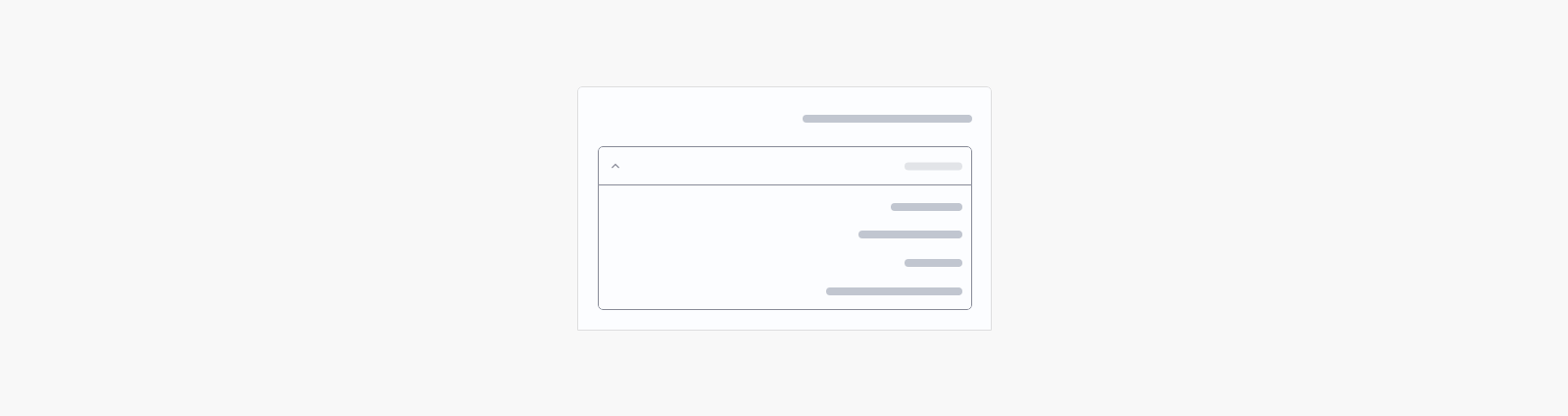
Select
<salla-select> web component is used to allow selection from a particular dropdown list, which can be an item's color, size, and so on. The component can be customized using the properties' parameters available.Example
Usage
HTML
SASS
Properties
| Property | Attribute | Description | Type | Default |
|---|---|---|---|---|
| Auto Complete | autocomplete | Enables multiple item selection. | boolean | false |
| Auto Focus | autofocus | Enables autofocus. | boolean | false |
| Chips | chips | Changes display of selections to chips. | boolean | false |
| Clear Icon | clear-icon | Applies when using clearable and the input is filled. | string | 'sicon-cancel' |
| Clearable | clearable | Adds input clear functionality. | boolean | false |
| Color | color | Applies specified color to the control. | "danger" | "dark" | "gray" | "light" | "primary" | "success" | "warning" | 'primary' |
| Disabled | disabled | Disable the input. | boolean | false |
| Flat | flat | Removes elevation or box shadow. | boolean | undefined |
| Hide Detail | hide-detail | Hides hint if any. | boolean | false |
| Hint | hint | Adds hint text. | string | undefined |
| Item Disabled | item-disabled | Sets property of items’s disabled value. | string | 'disabled' |
| Item Text | item-text | Sets property of items’s text value. | string | "text" |
| Item Value | item-value | Sets property of items’s value - must be primitive. Dot notation is supported. | string | "value" |
| Items | -- | Can be an array of objects or array of strings. When using objects, it will look for a text, value and disabled keys. | any[] | [] |
| Label | label | Sets label value. | string | undefined |
| Loading | loading | Displays linear progress bar. | boolean | false |
| Loading Color | loading-color | Specifies which color is applied to the progress bar. | string | 'primary' |
| Multiple | multiple | Enables multiple item selection. | boolean | false |
| Persist Hint | persist-hint | Forces hint to always be visible. | boolean | false |
| Placeholder | placeholder | Sets the input’s placeholder text. | string | undefined |
| Required | required | Enables multiple item selection. | boolean | false |
| Return Object | return-object | Changes the selection behavior to return the object directly, rather than the value specified with item-value. | boolean | false |
| Shape | shape | Defines the appearance of the component. | "outlined" | "underline" | 'outlined' |
| Size | size | Available sizing options. | "large" | "normal" | "small" | "x-large" | "x-small" | 'normal' |
| Value | value | The selected value. | any | undefined |
Modified at 2024-02-20 07:06:25