
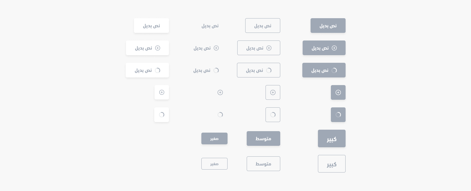
Button
<salla-button> web component shows a customizable button, in terms of size, color, style, status, position etc ,which can be used with any other web component, and that can be customized using the properties' parameters available.Example
Usage
HTML
JS
SASS
Properties
| Property | Attribute | Description | Type | Default |
|---|---|---|---|---|
| Color | color | Customized Button color | "danger" | "dark" | "gray" | "light" | "primary" | "success" | "warning" | 'primary' |
| Disabled | disabled | Button disability status | boolean | 'false' |
| Fill | fill | Button fill style | "none" | "outline" | "solid" | 'solid' |
| href | href | Button with a link capability | string | undefined |
| Loader Position | loader-position | Set the loading animation's position | "after" | "center" | "end" | "start" | 'after' |
| Loading | loading | Activate Button loading | boolean | 'false' |
| Shape | shape | Button type Configs | "btn" | "icon" | "link" | 'btn' |
| Size | size | Button size Configs | "small" | "medium" | "large" | 'medium' |
| Width | width | Button extends the full available width | "normal" | "wide" | 'normal' |
Methods
methods allow for calling functions built by Salla to carry out certain actvities, such as enable and/or disable loading the component.| Method | Description | Return Type |
|---|---|---|
disable() | Inactivates the button by adding disabled attribute. Visually, it becomes unclickable and unhoverable. | Promise<void> |
enable() | Activates the button by removing disabled attribute. | Promise<void> |
load() | Runs loading animation to notify a user that there is a processing taking place. | Promise<HTMLElement> |
stop() | Stops loading animation after a process has completed | Promise<HTMLElement> |
setText(html: string) | Customizes the button's body text | Promise<HTMLElement> |
Modified at 2024-08-18 09:20:48