
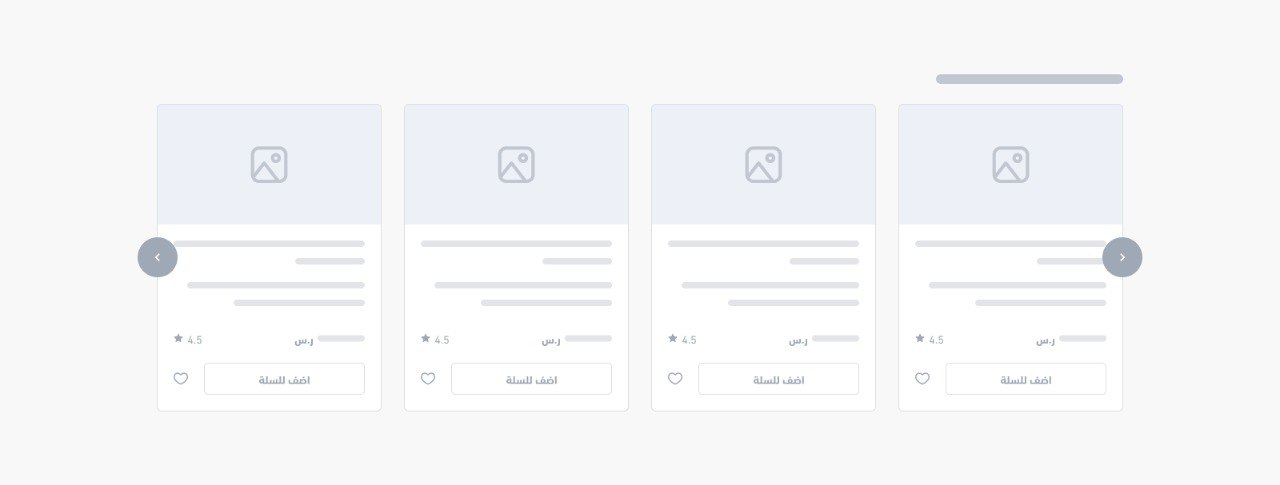
Products Slider
<salla-products-slider> web component is used to navigate horizontally through a group of related products. Product sliders can be easily arranged in a highly customizable layout, allowing for various product views or collections to be presented in a visually appealing way.Example
Usage
HTML
SASS
Note
salla-products-slider, uses inherently the default salla-product-card component. If you want to further customize the component, feel free to read more details from here.Properties
| Property | Attribute | Description | Type | Default |
|---|---|---|---|---|
| Auto Play | autoplay | Allow a products slider to automatically advance to the next slide. | boolean | undefined |
| Block Title | block-title | Title of the block, which works only if the slider is set to true | string | undefined |
| Display All URL | display-all-url | Lists down all URLs | string | undefined |
| Includes | includes | Specifies additional data to be included in the product fetch response. The value can be an array of strings or a JSON string. Example: - As an array: - includes=["options"]- As a JSON string: - includes='["options"]' The array or JSON string can include product options, "options", in the response. | string | string[] | undefined |
| Limit | limit | Limits the number of products in the list | number | undefined |
| Product Card Component | product-card-component | Custom Card Component for the Salla Products Slider. This property allows you to customize the appearance of individual product cards within a Salla Products Slider. | string | 'custom-salla-product-card' |
| Slider ID | slider-id | Slider ID's value. If it is not provided, it will be generated automatically. | string | undefined |
| Source | source | The Products List's source | "brands" | "categories" | "json" | "landing-page" | "latest" | "offers" | "related" | "selected" | "tags" | undefined |
| Source Value | source-value | The source value, which could be consisting of different values such as the following: • array of IDs when source in ['categories', 'brands', 'tags', 'selected'] | • keyword when source = 'search' | • products payload when source = 'json' | • product_id when source = 'related' | string | undefined |
| Sub Title | sub-title | The sub title of the block, which works only if the slider is set to true | string | undefined |