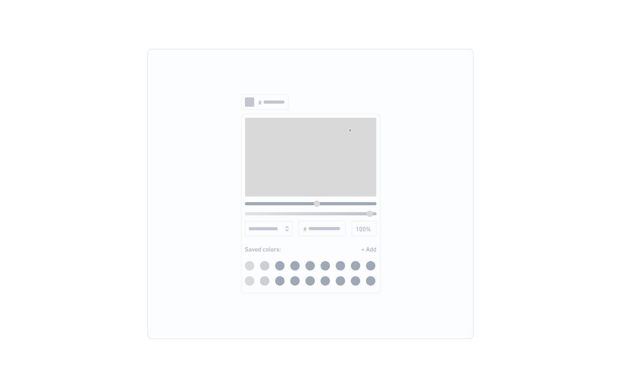
The <salla-color-picker> web component is used to select a color using a variety of input methods in a pop-up modal. Listen to events when the user changes the color or when the modal is either closed, open, or the chosen color has been submitted. Several methods can be used as well as customizable properties.Example#
Usage#
Properties#
| Property | Attribute | Description | Type | Default |
|---|
| Color | color | The initial color for the color picker component. | string | '#5dd5c4' |
| Enable Alpha | enable-alpha | Whether or not to enable the adjustment of the alpha channel. | boolean | false |
| Format | format | Displays the color picker component in a specific satndard coloring format. | "hex" | "hsl" | "rgb" | 'hex' |
| Name | name | File input name for the native formData | string | 'color' |
| Required | required | Whether or not to set the color picker to be required | boolean | false |
| Show Cancel Button | show-cancel-button | Whether or not to have a "Cancel" button, which closes the popup modal. | boolean | false |
| Show Text Field | show-text-field | Whether or not to show a text field for the color value when being edited. | boolean | true |
Events#
| Event | Description | Type |
|---|
colorChanged | This event will be fired when the color changes. | CustomEvent<Color> |
popupClosed | This event will be fired when the popup modal closes. | CustomEvent<Color> |
invalidInput | This event will be fired when the input is invalid. | CustomEvent<any> |
popupOpened | This event will be fired when the popup modal opens. | CustomEvent<Color> |
submitted | This event will be fired when the user clicks on the "Ok" button label. | CustomEvent<Color> |
Methods#
The pre-defined methods allow for calling functions built by Salla to carry out certain actvities, such as openPicker which shows or opens the color picker modal.| Method | Description | Return Type |
|---|
openPicker() | Shows / opens the color picker modal. | Promise<void> |
closePicker() | Closes / hides the color picker modal. | Promise<void> |
destroyPicker() | Releases all resources used by the color picker instance. | Promise<void> |
movePopUp(options: Options, openImmediately: boolean) | Moves the popup modal to a different parent class. It also has option of opening the component at the same time. | Promise<void> |
setColorValue(color: string, triggerEvent: boolean) | Sets / initializes the color picker component's color, which includes the Color name in RGBA/HSLA/HEX string or RGBA array. | Promise<void> |
setPickerOption(options: Options) | Sets the color picker component's options. | Promise<void> |
Modified at 2026-07-09 11:27:26