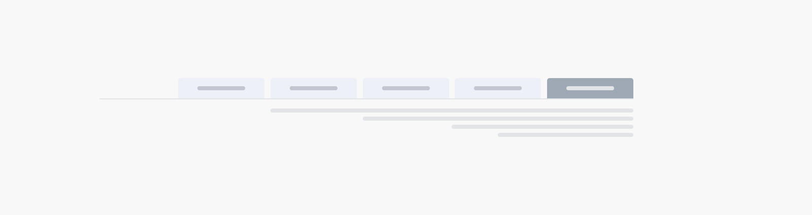
The <salla-tabs> web component makes it possible to have several panes inside a single view. This implies the content is presented in several independent panes, each of which can be seen independently of the others. If the user wants to see a certain section of the page, they click on that tab's header. The component groups several tabs/panes that each consists of <salla-tabs-header> and <salla-tabs-content> where:Salla Tabs Header: The <salla-tabs-header> web sub-component represents the tab for a specific tab/pane within the <salla-tabs> web component, allowing users to select and navigate to a particular section of the page.
Salla Tabs Content: The <salla-tabs-content> web sub-component represents the content or tab/pane associated with a specific header within the <salla-tabs> web component, displaying the relevant information or functionality when the corresponding tab is selected.
Example#
Usage#
Properties#
salla-tabs#
| Property | Attribute | Description | Type | Default |
|---|
| Background Color | background-color | Background color value | string | undefined |
| Vertical | vertical | Aligns tabs vertically. | boolean | false |
| Property | Attribute | Description | Type | Default |
|---|
| Name | name | Header identifier name to sync with the content. | string | undefined |
| Active Class | active-class | The class applied to the currently active(selected) tab | string | undefined |
| Height | height | Set the height of the tab bar | string or number | undefined |
| Centered | centered | Center tab items in the given flex. | boolean | false |
salla-tab-content#
| Property | Attribute | Description | Type | Default |
|---|
| Name | name | Set name of the tab content. Mainly used as a key to synchronize the content with it's respective header. | string | undefined |
Methods#
The pre-defined methods allow for calling functions built by Salla to carry out certain actvities, such as getChild which exposes self for the parent.| Method | Description | Return |
|---|
"getChild" | Expose self for the parent. | Promise<{selected: `boolean`, unselect: `boolean`, name: `string`, id: `string` }> |
salla-tab-content#
| Method | Description | Return |
|---|
"getChild" | Expose self for the parent. | Promise<{selected: `boolean`, unselect: `boolean`, name: `string`, id: `string` }> |
Events#
| Event | Description |
|---|
"tabSelected" | Emits event object when clicked or selected. |
Slots#
salla-tabs#
| Slot | Description |
|---|
content | The current and active tab content section. The salla-tab-content component is used here. |
header | The tab header section. The salla-tab-header component is used here. |
Modified at 2026-07-09 11:27:26