


Modal
<salla-modal> web component displays a dialog box or pop-up window on top of the current page. It is positioned above all other components in the application, restricting scrolling of the main page and only allowing scrolling of the modal's content. It consists of a Button component to activate the modal, and that can be customized using the properties, events, methods and slots' parameters available.Example
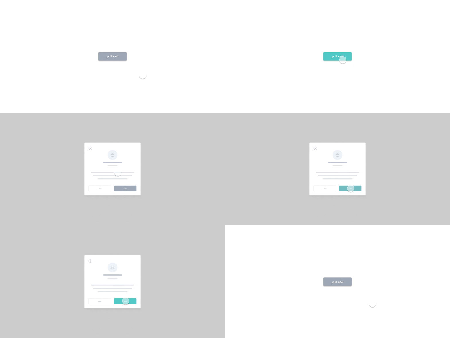
Usage
HTML
SASS
Properties
| Property | Attribute | Description | Type | Default |
|---|---|---|---|---|
| Cenetered | cenetered | Aligns the modal's content to be in center view | boolean | 'false' |
| Has Skeleton | has-skeleton | Opens the modal on rendering the component | boolean | 'false' |
| Icon Style | icon-style | Sets the modal's header icon style. | "error" | "success" |"normal" | "primary" | 'undefined' |
| Is Closable | is-closable | Sets the modal to be at the closing state | boolean | 'true' |
| Is Loading | is-loading | Shows the loading state in the modal | boolean | 'false' |
| No Padding | no-padding | Adds no Padding to the modal | boolean | 'false' |
| Position | position | Positions the modal in a fixed part of the screen | "bottom" | "middle" | "top" | 'middle' |
| Sub Title | sub-title | Sets the modal subheader context | string | '' |
| Sub Title First | sub-title-first | Whether or not to show the subtitle before the title | boolean | 'false' |
| Visible | visible | Shows the modal on rendering the component | boolean | 'false' |
| Width | width | Adjusts the size of the modal | "full" | "lg" | "md" | "sm" | "xl" | "xs" | 'md' |
Methods
methods allow for calling functions built by Salla to carry out certain actvities, such as close which closes the modal dialog.| Method | Description | Return Type |
|---|---|---|
close() | Closes the modal dialog | Promise<HTMLElement> |
loading() | Loads the modal dialog | Promise<HTMLElement> |
setTitle(modalTitle: any) | Sets the title of the modal dialog | Promise<HTMLElement> |
open() | Opens the modal dialog | Promise<HTMLElement> |
stopLoading() | Stops loading the modal dialog | Promise<HTMLElement> |
Note
open the component via the method:close the component via the method:Slots
slots makes it customizable to modify certain labels, such as footer| Slot | Description |
|---|---|
footer | Footer of the modal |
Events
| Event | Description | Type |
|---|---|---|
modalVisibilityChanged | This event will be fired when the modal visibilty is changed | CustomEvent<Boolean> |
Modified at 2026-07-09 11:27:26