
Header Components
header,breadcrumbs,menu and many more. Developers can easily modify these components, as we see in this article.Header Components Example
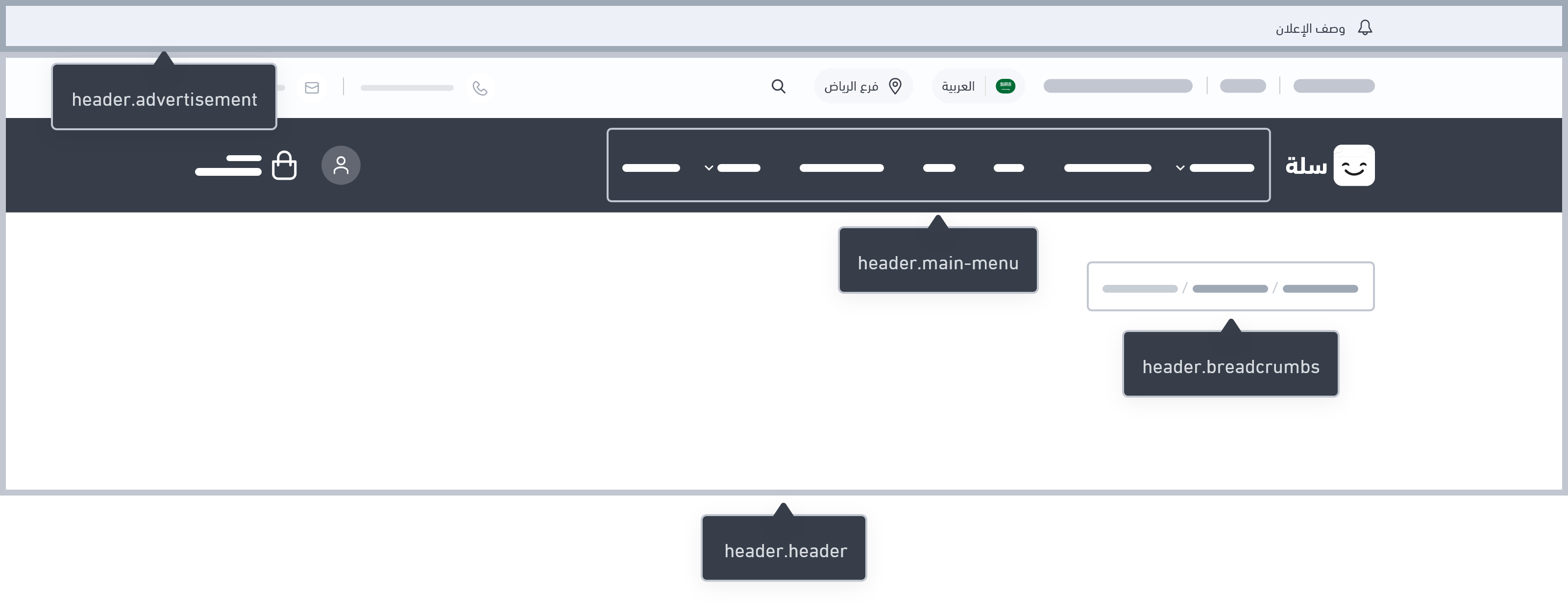
Header
breadcrumbs and main menu.Troubleshooting Tip
header design can occasionally be hidden. You can see twilight::errors in the browser's console logs, where you can investigate the problem. The following illustrates the error as follows:Array to string conversion in File [src/views/components/header/header.twig] at line 7{% set nav_type = theme.settings.get('your_arrayable_key') %} retrieves the value of a setting from the Twilight theme settings. The developer needs to replace your_arrayable_key with the actual key representing the setting that contains the array.nav_type is an array. If it is an array, you are setting nav_type to its first item. This way, you avoid the error related to converting the array to a string.Educational Clip
Advertisement
Variables
Advertisement
Usage
advertisement object, we can get the details of advertisement.icon, advertisement.url, advertisement.description, and so on. The developer can use these data within any style designed by them.Breadcrumbs
Variables
Breadcrumbs
Usage
breadcrumbs , which is an array of breadcrumb described by their title and url. A loop goes through this object and display its parts. Developer has the option to edit the look-and-feel of this object.Menu
Variables
Menus
Usage
menus contains the details of each item in the menu. Using a loop these menu items can be displayed.Educational Clip
Menu Item
Usage
Modified at 2024-09-03 08:26:33