Salla Docs
Merchant API
  • Merchant API
  • Salla OAuth 2.0
Partner APIs
  • App API
  • Shipment API
Storefront
  • Twilight Engine
  • Twilight SDK
  • Web Components
  • Change Log
Salla CLI
Merchant API
  • Merchant API
  • Salla OAuth 2.0
Partner APIs
  • App API
  • Shipment API
Storefront
  • Twilight Engine
  • Twilight SDK
  • Web Components
  • Change Log
Salla CLI
Salla - Opensource
Salla - Developers Community
  1. Common Components
  • Getting Started
    • Create a theme
    • Develop a theme
    • Setup a theme
    • Publish a theme
  • Requirements & Review
    • Overview
    • Main Requirements
    • Review Process
      • UI / UX Review
      • Technical Review
      • Metadata Review
      • Pre-Launch Review
  • Files and Folders Structure
    • Directory structure
    • Twilight.json
  • Twig Template Engine
    • Basic syntax
    • Twilight flavoured twig
  • Theme Architecture
    • Layouts
      • Overview
      • Master Layout
      • Global Variables
      • CSS Variables
      • Salla Icons
      • Custom Fonts
      • Hooks
      • Localizations
    • Pages
      • Overview
      • Home Page
      • Product Pages
        • Products listing
        • Single product
      • Customer Pages
        • Profile
        • Orders list
        • Order details
        • Wishlist
        • Notifications
      • Blog Pages
        • Blog listing
        • Single blog
      • Brand Pages
        • Brands listing
        • Single brand
      • Common Pages
        • Cart
        • Loyalty
        • Thank you
        • Single page
        • Landing Page
    • Componenets
      • Overview
      • Home Components
        • Youtube
        • Fixed banner
        • Testimonials
        • Parallax background
        • Photos slider
        • Store features
        • Square photos
        • Fixed products
        • Products slider
        • Featured products - Style 1
        • Featured Products - Style 2
        • Featured Products - Style 3
        • Brands
        • Enhanced Square Banners
        • Main Links
        • Enhanced Slider
        • Slider Products with Headers
        • Latest Products
        • Vertical Menu with Slider
      • Product Components
        • Essentials
        • Options
      • Common Components
        • Header Components
        • Footer Components
        • Comments component
  • Change Log
  1. Common Components

Comments component

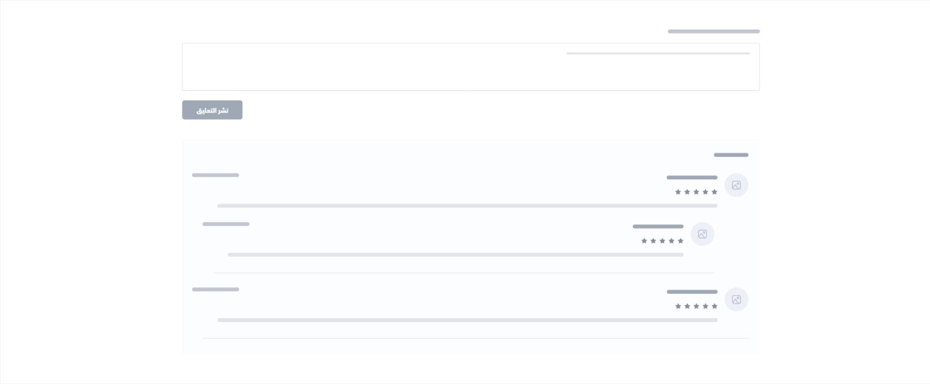
This component is used to display a threaded comments section that also allows adding comments and rating them. It can be displayed as a feedback of products or testimonial which are shown in Single product page and Single page.
The following is the location of the Comments component

Example#

Comments

Variables#

Comments
comments
array[object (Comments) {10}] 
optional
This object is a Paginator as well, so it performs the pagination function and to specify which view should be used to create pagination links. Example: comments.next_page
id
integer 
optional
Id of the comment.
avatar
string 
optional
The image of the user that gave the comment.
name
string 
optional
Name of the user that made the comment.
has_order
boolean 
optional
Whether the user who made the comment has an order or not.
created_at
string <date>
optional
Comment creation date.
Example:
dd/mm/yyyy
stars
integer 
optional
Stars rating for the comment.
content
string 
optional
Content of the comment.
is_pending
boolean 
optional
Whether the comment is approved yet.
replies
array[object (Comments) {10}] 
optional
Replies to the comment.
type
enum<string> 
optional
Type of the user that created the comment.
Allowed values:
admincustomer
type
enum<string> 
optional
The type of the page where the comment is displayed.
Allowed values:
pageproduct
id
enum<integer> 
optional
The ID of the page or product page where the comment is displayed.
Allowed values:
pageIdProductId

Usage#

This component will check the eligibility of the user to create comments. If the user is allowed, the component will display comment section contaiting the text field to allow user to comment and submit the comment using salla-button.
Next, the component checks comments availability then uses salla-infinite-scroll to display the comments in a for-loop. It will also display the comments' details such as name, avatar, has-order, rating star, created date, comment content and checks if the user type is admin. As shown in the below code.
Modified at 2025-03-04 12:54:02
Previous
Footer Components
Next
Change Log