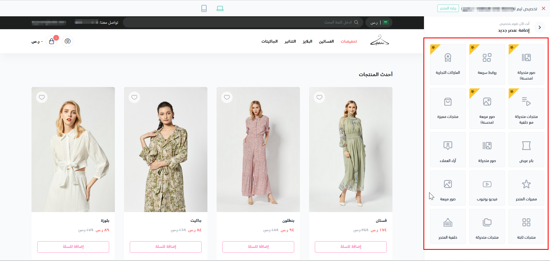
Home Page
home page template renders the first page which the customer encounters. This page is essential to give the first impact of the store's look-and-feel. The main store attractions are located on this page to showcase the ease of accessibility to go around the store.Example

Variables
HomePage
Components
features section. Which are located in the src/views/components/home/ folder and were developed specially for the Home Page.twilight.json file in this article.A thing to know!
component- inside twilight.json.{% component home %} renders the following Theme Features as per the store's settings.Theme Feature | Discription |
|---|---|
| Youtube | This feature is responsible for displaying Youtube videos that the developer preselects. |
| Fixed Banner | Fixed banner is the area in charge of displaying a banner that is fixated on the home page. |
| Featured prodcuts style 1 | Using this feature, showcases the featured products in a pre-defined style. |
| Featured prodcuts style 2 | Using this feature, showcases the featured products in a pre-defined style. |
| Featured prodcuts style 3 | Using this feature, showcases the featured products in a pre-defined style. |
| Testimonials | This feature displays testimonials that the developer preselects. |
| Parallax backgorund | This feature displays products with a backgournd that zooms out slowly giving a 2D effect. |
| Photos slider | Photos are displayed in a slider by using this feature. |
| Store Features | This feature oversees the display of store's overall features, such as detailed product description or customer review of the product. |
| Square photos | Use this feature to display photos in a square shape. |
| Fixed products | Use this feature to pin the products that you wish to have displayed always. |
| Products slider | This slider feature helps navigate between products vertically/horizontally. |
| Latest Products | This feature displays the latest products added to the store automatically. |
| Vertical Menu with Slider | This feature display a vertical menue with slider to display links and images |
Theme Preview

Usage
src/views/pages/index.twig. The goal here is to enable the developer to perform any design or appearance he may need for this page.Theme Features and Theme Components
The new Theme Component should be:
src/views/components/*.twigtwilight.json under the components section.twilight.json where we delcare a new Theme Component named "custom-slider".path of the new component is mentioned in "path": "home.custom-slider". This means that the new component is located inside src/views/components/home/custom-slider.twig.Note
src/views/components/ folder.| Components | Description |
|---|---|
| Brands | Brands' logos of the store are displayed in this component section. |
| Main links | This component helps to portray the store main links. |
| Enhanced Slider | The slider component helps navigate vertically/horizontally. |
| Slider products with header | Slider products with header displays the products in a slide and give the sldier a header title. |
| Enhanced Square Banners | Enhanced banners in a square shape are displayed with this component's help |
src/views/pages/index.twig file for the Home Page, where, in line #3, the {% component home %} renders both of the Theme Features and Theme Components.
Static Content
Modified at 2025-03-04 12:54:02
