
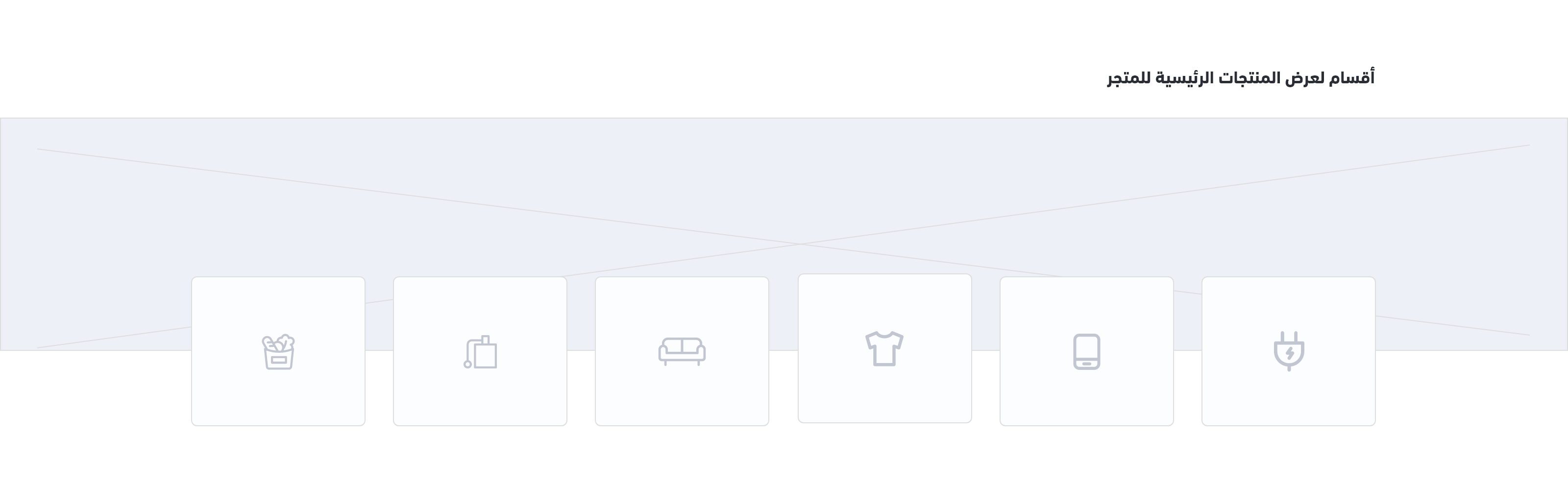
Main Links
Example
Settings
{
  "version": ...,
  "theme_name": ...,
  "repo_url": ...,
  "support_url": ...,
  ...
  "components": [
    {
      "name": "main-links",
      "title": "Main Links",
      "icon": "sicon-layout-grid-rearrange",
      "path": "home.main-links",
      "fields": [
        {
          "id": "title",
          "type": "string",
          "label": "Title",
          "placeholder": "Enter the title here",
          "required": false
        },
        {
          "id": "links",
          "type": "collection",
          "format": "collection",
          "required": true,
          "minLength": 3,
          "maxLength": 6,
          "label":"Links and Icons",
          "fields": [
            {
              "id": "icon",
              "type": "string",
              "format": "string",
              "label": "Icon",
              "placeholder": "Tplacehoder text",
              "required": true
            },
            {
              "id": "title",
              "type": "string",
              "placeholder": "Enter link title here...",
              "label": "Link title",
              "required": true
            },
            {
              "id": "url",
              "type": "string",
              "format": "url",
              "label": "Link url",
              "placeholder": "Enter link url here...",
              "inputType": "url",
              "required": true
            }
          ]
        },
        {
          "type": "boolean",
          "label": "Merge with top component",
          "id": "merge_with_top_component",
          "format": "switch",
          "selected": true
        }
      ]
    },
  ]
}
Theme Preview

Variables
HomeMainLinks
Usage
This component uses the
link url and link icon for example, and displays them using a for-loop.Modified at 2024-02-12 13:44:48