
Footer Components
contacts, payment-methods, social media links, and many more.Footer Components Example
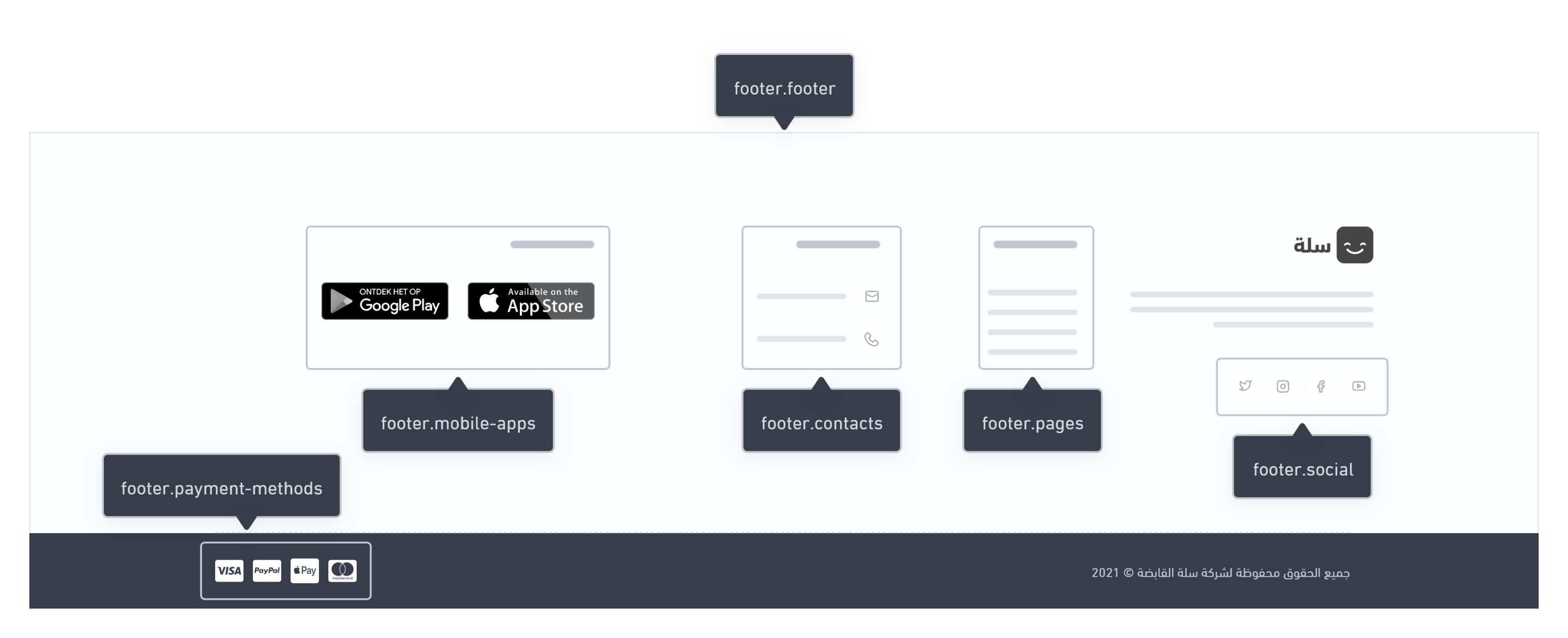
Footer
contacts, payment-methods, and social.Usage
Educational Clip
Contacts
Variables
Contacts
contacts
array [object {5}]
optional
name
string
optional
type
string
optional
Example:
`whatsapp` , ` mobile` , `phone` , ` telegram` , `email`.
icon
string
optional
url
string
optional
Example:
tel:+966555555555
Usage
contacts. Each option in the array represents a specific contact detail. The developer can use a loop statement to display all of the contacts details. Below is an example of that.Mobile-app
Variables
FooterMobileApps
apps
array [object {2}]
optional
name
enum<string>
optional
Allowed values:
appstoregoogleplay
url
string
optional
Usage
apps, and then display each element using a for-loop statement.Menu
Variables
FooterMenu
items
array[object (link) {4}]
optional
id
integer
optional
title
string
optional
url
string
optional
target
enum<string>
optional
Allowed values:
'_blank''_self'
Usage
items, and then display each element using a for-loop statement.Payment-methods
Variables
FooterPaymentMethods
payment_methods
array[string]
optional
mada, credit_card, bank (Bank transfer (Transfer receipt)), cod (Cash On Delivery), ...]Usage
payment_methods, and then display each element using a for-loop statement.Social Links
Variables
FooterSocialLinks
links
array [object {4}]
optional
name
string
optional
type
string
optional
Example:
`instagram` , ` twitter` , ` snapchat` , ` tiktok` , `youtube` , `facebook` , `pinterest`
icon
string
optional
url
string
optional
Usage
links, and then display them our using a for-loop statement.Modified at 2024-09-03 08:34:33