Salla Docs
Merchant API
  • Merchant API
  • Salla OAuth 2.0
Partner APIs
  • App API
  • Shipment API
Storefront
  • Twilight Engine
  • Twilight SDK
  • Web Components
  • Change Log
Salla CLI
Merchant API
  • Merchant API
  • Salla OAuth 2.0
Partner APIs
  • App API
  • Shipment API
Storefront
  • Twilight Engine
  • Twilight SDK
  • Web Components
  • Change Log
Salla CLI
Salla - Opensource
Salla - Developers Community
  1. Pages
  • Getting Started
    • Create a theme
    • Develop a theme
    • Setup a theme
    • Publish a theme
  • Requirements & Review
    • Overview
    • Main Requirements
    • Review Process
      • UI / UX Review
      • Technical Review
      • Metadata Review
      • Pre-Launch Review
  • Files and Folders Structure
    • Directory structure
    • Twilight.json
  • Twig Template Engine
    • Basic syntax
    • Twilight flavoured twig
  • Theme Architecture
    • Layouts
      • Overview
      • Master Layout
      • Global Variables
      • CSS Variables
      • Salla Icons
      • Custom Fonts
      • Hooks
      • Localizations
    • Pages
      • Overview
      • Home Page
      • Product Pages
        • Products listing
        • Single product
      • Customer Pages
        • Profile
        • Orders list
        • Order details
        • Wishlist
        • Notifications
      • Blog Pages
        • Blog listing
        • Single blog
      • Brand Pages
        • Brands listing
        • Single brand
      • Common Pages
        • Cart
        • Loyalty
        • Thank you
        • Single page
        • Landing Page
    • Componenets
      • Overview
      • Home Components
        • Youtube
        • Fixed banner
        • Testimonials
        • Parallax background
        • Photos slider
        • Store features
        • Square photos
        • Fixed products
        • Products slider
        • Featured products - Style 1
        • Featured Products - Style 2
        • Featured Products - Style 3
        • Brands
        • Enhanced Square Banners
        • Main Links
        • Enhanced Slider
        • Slider Products with Headers
        • Latest Products
        • Vertical Menu with Slider
      • Product Components
        • Essentials
        • Options
      • Common Components
        • Header Components
        • Footer Components
        • Comments component
  • Change Log
  1. Pages

Home Page

The home page template renders the first page which the customer encounters. This page is essential to give the first impact of the store's look-and-feel. The main store attractions are located on this page to showcase the ease of accessibility to go around the store.
Following is the page location and url :

Example#

Single page

Variables#

HomePage
page
object 
optional
title
string 
optional
Title of the page. May include html tags.
slug
enum<string> 
optional
Meaningful unique identifier that is readable by users. Slug are predifned valued in which each page has a list of allowed values. Below are the allowed values for this page.
Allowed value:
index

Components#

By default, the home page displays a collection of Theme Features listed in the twilight.json under the features section. Which are located in the src/views/components/home/ folder and were developed specially for the Home Page.
More about twilight.json file in this article.
A thing to know!
The Theme Features names have the prefix component- inside twilight.json.
Developer must remove the Theme Features that will not be used in the theme.
It's advised to use the Theme Features as a best practise to ensure a smooth experience for all Salla partners.
The content of {% component home %} renders the following Theme Features as per the store's settings.
Theme Feature
Discription
YoutubeThis feature is responsible for displaying Youtube videos that the developer preselects.
Fixed BannerFixed banner is the area in charge of displaying a banner that is fixated on the home page.
Featured prodcuts style 1Using this feature, showcases the featured products in a pre-defined style.
Featured prodcuts style 2Using this feature, showcases the featured products in a pre-defined style.
Featured prodcuts style 3Using this feature, showcases the featured products in a pre-defined style.
TestimonialsThis feature displays testimonials that the developer preselects.
Parallax backgorundThis feature displays products with a backgournd that zooms out slowly giving a 2D effect.
Photos sliderPhotos are displayed in a slider by using this feature.
Store FeaturesThis feature oversees the display of store's overall features, such as detailed product description or customer review of the product.
Square photosUse this feature to display photos in a square shape.
Fixed productsUse this feature to pin the products that you wish to have displayed always.
Products sliderThis slider feature helps navigate between products vertically/horizontally.
Latest ProductsThis feature displays the latest products added to the store automatically.
Vertical Menu with SliderThis feature display a vertical menue with slider to display links and images

Theme Preview#

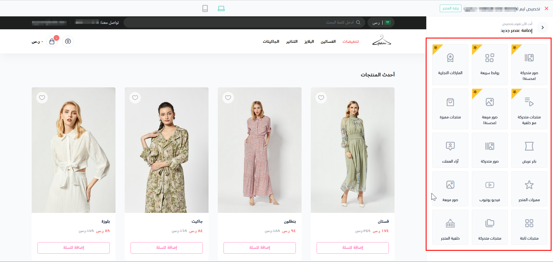
The components can be added using the theme preview in the Theme menu item of Salla Partners Portal. The developer can add the component and enable it in the theme preview dashboard.
Theme Preview Dashboard

Usage#

Twilight provides two different methods to handle the Home Page via the file src/views/pages/index.twig. The goal here is to enable the developer to perform any design or appearance he may need for this page.
The methods are:
Theme Features and Theme Components
Developer Static Content

Theme Features and Theme Components#

This is the default method, in which the Home Page simply displays the Theme Features explained in the previous section of this article.
In addition to the Theme Features, the developer has the option to build their own/new Theme Component(s) as per the store’s requirements.
The new Theme Component should be:
Created inside the path src/views/components/*.twig
The schema is declared inside the file twilight.json under the components section.
Following is an example of the twilight.json where we delcare a new Theme Component named "custom-slider".
In the previous example, the path of the new component is mentioned in "path": "home.custom-slider". This means that the new component is located inside src/views/components/home/custom-slider.twig.
Note
The developer has the option to create their component anywhere within the src/views/components/ folder.
Twilight is shipped with some ready Theme components, which can be easily modified by the developer. Below is the list of these Theme Components.
ComponentsDescription
BrandsBrands' logos of the store are displayed in this component section.
Main linksThis component helps to portray the store main links.
Enhanced SliderThe slider component helps navigate vertically/horizontally.
Slider products with headerSlider products with header displays the products in a slide and give the sldier a header title.
Enhanced Square BannersEnhanced banners in a square shape are displayed with this component's help
Below is the src/views/pages/index.twig file for the Home Page, where, in line #3, the {% component home %} renders both of the Theme Features and Theme Components.
The visibility of each of the Theme Features and Theme Components in the Home Page is managed from the Partners Portal. This means that the partner has the ability to show/hide any of the Theme Features and Theme Components.
Theme Features

Static Content#

In this method, the developer has the option of building their own static content without using the Theme Features nor Theme Component(s). However it's highly advised to utalize the previous methods to ensure a smooth expereince for the end users.
The added static content does not depend on any of the Store settings. It will be displayed as per the given design by the developer. Below is an example for this method.
Previous
Overview
Next
Product Pages